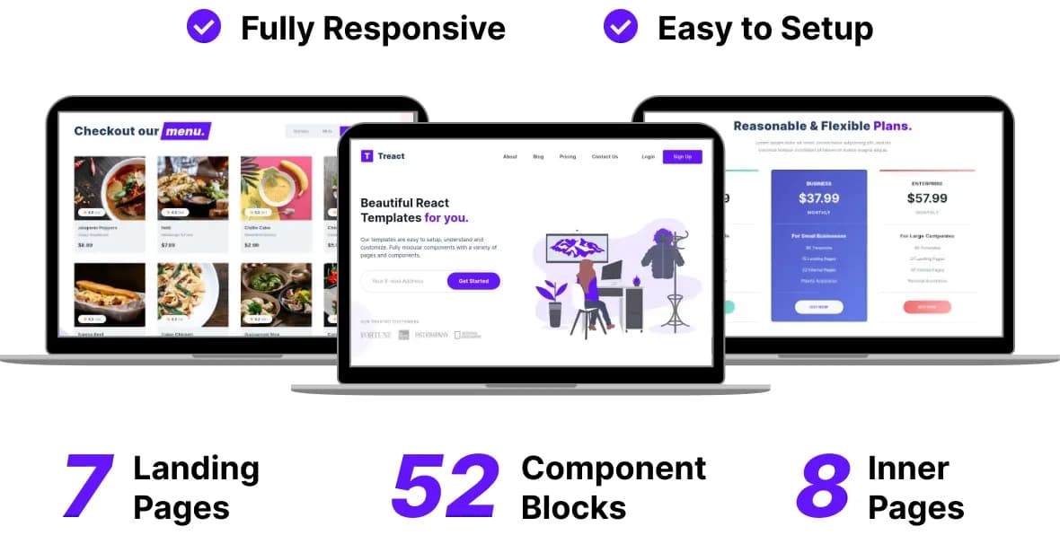
Treact is a free set of UI components built with React and TailwindCSS (twin.macro). It has 52 unique components for all sections that a landing page might have. It also includes 7 prebuilt landing page demos for ready made use along with 8 inner page demos.
It has fully responsive components sufficient for creating any modern landing page using React and TailwindCSS.
It contains many components of various sections like Hero, Testimonials, Features, Blog Index, CTA, Pricing, Cards, FAQs, Header, Footers.
Customizing things such as brand colors or other colors is also pretty easy using a simple variable change, thanks to Tailwind’s configuration file.
The UI Components as well as the prebuilt demos are fully responive. A lot of components (however, not all) accept many customization props to change the content or certain style characterisitcs.
To customize content or styles of components whose styles are not exposed, you can directly edit the component file, which should be simple to understand as it’s just using styled-components.
Sections below explain the project’s structure, configuration, and license. Feel free to hit me up with any questions you have on Twitter - @owaiswiz or on my email.
Live Demo
There is a live demo available with all prebuilt pages and components available here - Treact Live Preview.
Download
You can download the library from here - Download Treact.
Features
- 52 UI Components
- 7 Landing Pages
- 8 Inner Pages
- Fully Responsive
- Fully Customizable
License
Treact is free for personal as well as commercial use. You however, cannot use Treact to create derivative competing products.
What this means is, you cannot sell Treact by renaming it to something else or modify parts of it and then sell it. Or package it in some other product with the intent to provide similar UI components or themes.
There is no need for any kind of attributions, though it is appreciated.
Usage
If you want to learn how to use Treact components in your own project, checkout this post - Using Treact Components within your own React Project
This post explains the file structure of Treact, and how you can start/customize the demo Treact app that you download.
File Structure
This project was bootstrapped by using create-react-app. The component blocks are placed inside src/components/ directory.
There are Hero, Testimonials, FAQs, Cards, etc subdirectory inside the components directory containing the relevant components.
All the prebuilt landing pages are inside src/demos directory. All the prebuilt inner pages like login, signup are inside src/pages directory.
All the images, icons and illustrations used by the components are inside src/images.
Other than this, src/helpers contains some helper components used internally by the component that you mostly shouldn’t be concerned about.
Running and Building
First and foremost, make sure you install the necessary dependencies using (yarn or npm) from the downloaded project directory
npm install
In the project directory, you can run
npm run start
This will start the project in development mode available at http://localhost:3000 with live reload (thanks to create-react-app).
You can also build the project into a static website for deployment if you choose to.
npm run build
Component Customization
Like I said earlier, most components can be customized by changing the values to the props they accept.
To see what props they accept, simply open the component file you want to customize and then you should see all the customizations available to you.
For internal component customization, this component uses TailwindCSS for styles using styled-components and twin.macro.
If you want to customize the styles you can learn more about them here: Tailwind CSS, styled-components, twin.macro.
Changing Brand Colors
Changing the brand color is really simple, along with any other color. Simply open up src/tailwind.config.js with your editor.
Over here edit the values for the color object which has keys like primary, secondary denoting primary color, secondary color respectively.
Each color has 9 shades denoted by 100, 200 , 300 , 400, … 900, so make sure you change these to whatever you want.
Primary color is the brand color while secondary color is often used for grayish headings.
That’s all. If you have any questions, again feel free to contact me on Twitter - @owaiswiz or on my email.
Get more articles like this
Subscribe to my newsletter to get my latest blog posts, and other freebies like Treact, as soon as they get published !
